
Why hire us
He’s the programmer. She’s the designer. Together Trevellyan.biz offers everything advertising and I.T. in Columbia County NY and beyond. ... more

He’s the programmer. She’s the designer. Together Trevellyan.biz offers everything advertising and I.T. in Columbia County NY and beyond. ... more

There are two questions that we are almost always asked when a client is deciding whether or not to hire us to build or redesign their website. 1. ... more
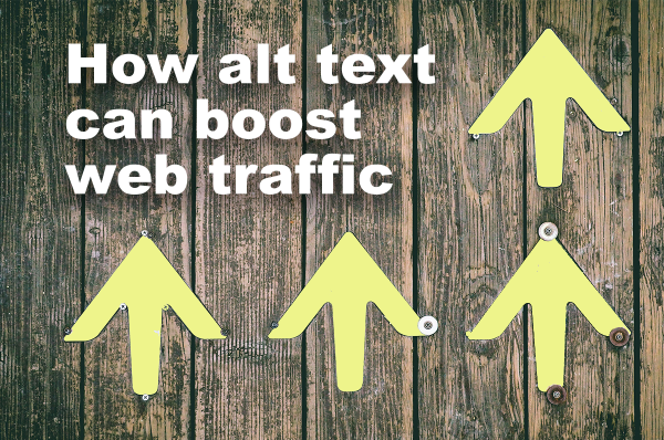
There are many things you can do to increase the number of people who find your website. In this blog post we address one of those techniques: optimizing ... more

If your goal is to be found by people who already know you, then a single page website could work. However, if you want to drive to your ... more

Your web developer will be responsible for creating the virtual face of your company. Your website is likely to be the first interaction a potential customer has with ... more

Header tags indicate to search engines what the page is about. They are also important because they tell a browser how to style a piece of text on ... more

When someone first lands on your website, they will make a split-second judgement about who you are and what you do. Your goal is to communicate, in a ... more
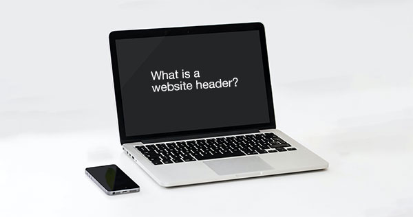
A website header is the strip of content at the top of a website. At a minimum, the header should contain a logo and navigation to the most ... more

It is difficult to overstate the importance that website photos play in communicating a message. High-quality photos that are relevant to your message can help support your branding ... more

The Americans with Disabilities Act (ADA) requires that web content be accessible to everyone. All too often, when site owners learn about this requirement, they reach for what ... more

Unlike every other form of advertising, websites are never finished. Done right, a website is a work in progress. Continually update and improve. ... more