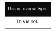
Reverse type. You see it all the time – light text on a dark background. Some designers use it to give variety to a page layou. Others are looking to make their designs “pop.” But how does reverse type affect readability?
The question desighers should always ask is “Will the user find this easy to read?” While you want people to notice your work, your goal is to have it read. To see it but not read it isn’t enough.
There has been a significant amount of research on inverted color schemes. A 1980 study from London found “dark characters on a light background are superior to light characters on a dark background… participants were 26% more accurate in reading text when they read it with dark characters on a light background.”
A study at Austin State University found “in every color combination surveyed, the darker text on a lighter background was rated more readable than its inverse (e.g. blue text on white background ranked higher than white text on blue background).”
Even advertising guru David Ogilvy, who did research in the 1970s, found that ads with black on white text had a three times higher response rate than ads with white on black text.
According to a 1989 study by the J Am Optom Assocation, 45% of the population has an astigmatism. This huge group finds it harder to read white text on black than black on white. That’s a lot of people. Ignore their needs and they may never read your ad, webpage or sign.
And there are other readability factors. Consider reading something on your laptop or cellphone. If the user is in a bright room or outdoors, then white type on black background can become unreadable.
There are exceptions to every rule. Using light text on a dark background can help direct one’s attention to a single element, as in a single word heading, a title or a label. But as a general rule, make the text easy to read and more people will read it. Use dark type on a light background rather than light on dark.
If you need help designing an ad, brochure, website or sign, give Suzanne a call at 518.392.0846 or email [email protected].


Excellent column! I’m going to forward this to my cable company, which has made their station guide almost impossible to read by using a back background with (small) white print. Complaints from users, which started in June 2016, go unheeded. Very frustrating!
Penny Van Amburg
Tucson AZ, USA
Hi Penny,
That does sound frustrating.
Thanks for the feedback!