

When building a new website, one of the decisions that needs to be made is whether to use a horizontal or vertical layout for the primary navigation. Before the advent of mobile devices, vertical menu bars were popular. They are used less often today. In this article we address the pros and cons of horizontal and vertical primary menu bars.
What is a navigation menu bar?
Every multipage website needs a way for the user to move from one page to another. A navigation bar or menu bar is how we do that. The bar is found either at the top or side of every page and includes links to other pages on the site.
What is horizontal navigation?
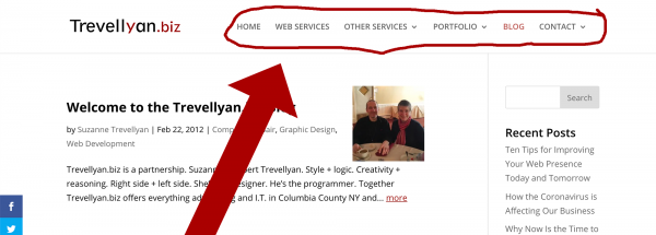
A horizontal website navigation bar is a list of links at the top of each page. It may be above, below, to the left or to the right of the header or logo, but it is always placed before the main content of the page and is consistent on every page.
Below is a screenshot of the horizontal navigation on our website.
What is vertical navigation?
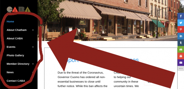
A vertical navigation bar is a list of links on the left or right side of each page.
See the screenshot below for an example of vertical navigation on a website we built several years ago.
Pros and cons of horizontal navigation
Pros
- Many modern site designs include full width images. Horizontal navigation integrates more easily with this type of design.
- English speakers read from left to right, so the left to right order of links on a horizontal navigation bar feels natural.
- Most websites use horizontal navigation, so users are familiar with it.
- Horizontal navigation gives the designer more flexibility with regard to design of the primary content area, the body of the page. (See our related article: What Are The Structural Parts of a Website.)
- The space for horizontal navigation is limited. Therefore, designers must work within finite space constraints. This may seem like a negative (see Cons below), but in fact, it requires developers to be more thoughtful about the exact words that they use. Studies find that web readers do not actually read. Rather, they scan the text. The more concise the text, the more likely they are to find what they need quickly and easily.
- The Eyetrack III: What We Saw When We Looked Through Their Eyes study observed 46 people for one hour as their eyes followed mock news websites and real multimedia content. Navigation placed at the top of a homepage performed best.
Cons
- Limited space requires more thoughtful attention to the number and specific wording of navigation links.
- For the same reason as above, adding top level links can be challenging.
- Open drop down submenus may temporarily overlap the main content.
Vertical (sidebar) navigation
Pros
- There is room for a greater number of top level links.
- Link names can be longer.
- Adding a new link is simpler.
- Some businesses want to be perceived as different or bucking the trend. In this case, vertical navigation may be preferred just because it is less common.
Cons
- Because vertical menus were more common in the past, using one now can make a website look old-fashioned and out-of-date.
- Some site visitors will be less comfortable using a sidebar navigation, because that type of menu is less common than horizontal.
- With unlimited space for top level links, there is less incentive to organize the content into a smaller number of top level categories or subject areas. It allows the designer to be lazy about deciding what’s most important and what is secondary.
- Vertical navigation wastes valuable space. The navigation lives in the sidebar, which extends to the bottom of the page. Therefore, the space below the navigation cannot easily be integrated into the main content area. Consequently, the width of the viewing area is never fully utilized.
- On most mobile devices, the vertical navigation will revert to a hamburger menu the same way horizontal navigation does. This means that you’ve just compromised on your design for a layout that only half the visitors will ever see.
- The user may find it more difficult to go from a vertical menu item to its corresponding submenu, which extends to the side, than it is to go from a horizontal top-level menu item to its sub-menu, which extends below. This is because the motion to engage a flyout menu is across then down rather than simply straight down. And if they try to go directly to an item further down the sub-menu with a diagonal motion of their mouse, the sub-menu will often disappear, which is frustrating.
There are, of course, exceptions to every rule
- Ecommerce sites often require extensive navigation menus that simply will not fit horizontally.
- Sites with top level navigation links that must change frequently are good candidates for vertical navigation. While we know concise navigation is best for most users, we understand that everything can’t always be perfect. Vertical navigation doesn’t have the tight space restrictions that horizontal navigation does. Therefore it’s easier for the person updating the site to change top level links without having to make sure it fits within a limited space.
- Sites where top level links necessarily have long names can benefit from vertical navigation.
Which primary navigation bar style should you use?
There is no right or wrong answer to this question. The style you choose will depend on your goals and priorities, how willing you are to spend the time optimizing your information architecture and which layout your audience will be most familiar with.
If you’d like to learn more about our services, call (518) 392-0846, email [email protected] or visit our Website Design and Development Services page.