
What makes a good deli website?
There are five key elements to every website: appearance, content, functionality, usability, and search engine optimization. These elements are universal regardless of the website’s purpose, but this article addresses deli websites in particular
Most delis strive to offer good food, at a good price, with efficient service. If this is true for your deli business, then your website should also reflect these characteristics. Your deli website should look focused, well-organized, and clean.
Each time we prepare to start a new website project for a client, we look at hundreds of websites in their industry. We review websites from across the nation, and pay particular attention to local businesses who are likely competitors. Doing this gives us a good idea of what others are doing and what kinds of things customers will expect from a website (in this case, a deli website). By doing this we can also see how different businesses with different priorities promote their specialties.
Best deli website – DELICATUS
Delicatusseattle
Of all the websites we reviewed, Delicatus was a standout. There are several features that we particularly like.
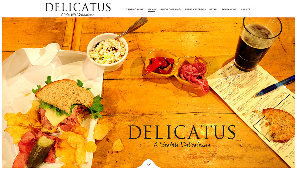
Single hero image
The homepage of this site has great impact. The hot peppers, pickled onions, and fresh-looking coleslaw illustrate their attention to detail, while the paper-wrapped sandwich, with pickles and chips, still says Deli.
The rest of the homepage is just as thoughtful. Lots of white spaces enhances the cleanliness aspect, and short excerpts of longer pages are well-written and engaging. Delicatus takes the almost ubiquitous slider banner and simplifies it. A single image rather than multiple images is good because it saves load time. In addition, a single image can be more memorable. Finally, the interior pictures are great because they give a good idea of the vibe without giving away too much.
There are a few things going on inside the site that are worth noting. Menus are not PDFs, which is good for everyone. The Food News page, while not used frequently, addresses topics that reinforce the brand.
CATERING BY MICHAELS
Catering by Michaels
When you are considered an expert in your field, your brand will be trusted. But how is this achieved? A good way to start is to provide content and advertising that demonstrates your depth of knowledge. The idea behind authority marketing is to drive new business by positioning yourself and your business as an expert.
Authority marketing
Most businesses restrict the content of their website to the products they sell and the services they offer. Another approach is to provide your target audience with free information that they will find valuable. While other companies are trying to win a deal, you can be the expert, inspire confidence and attract new business.
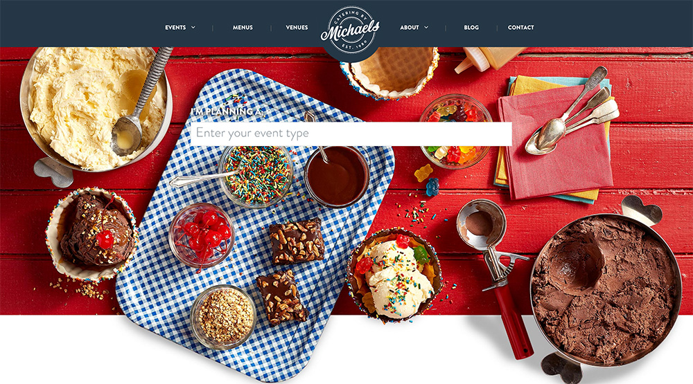
Let’s take a wedding caterer, as an example. One potential target audience for wedding catering is brides and grooms. What kind of information, above and beyond details about their own services, can a wedding caterer provide the engaged couple? What information might the couple find useful in the planning of their big day? Catering by Michaels has thought about this. That’s why they have provided an extensive list of wedding venues in their area.
This interesting section features dozens of local venues, along with relevant details about each. Some of these details include capacity, style, location and amenities. While this information isn’t about the Catering by Michael’s business, it gives potential customers an easy way to research possible venues. Obviously, this website doesn’t answer every possible question they may have, but it provides a way to narrow down the venue options. Rather than wasting time searching venues one by one, the bride and groom can spend more of their time thinking about what food to serve.
Other kinds of information that a wedding caterer could provide include:
- fashionable honeymoon destinations
- bridal gift ideas
- popular wedding songs
- wedding trends
Authority marketing can put your business in front of people who are likely looking for the services you offer. Even if your company is small or less well-known, authority marketing provides the opportunity to demonstrate your depth of knowledge.
SOPRAFFINA
Sopraffina
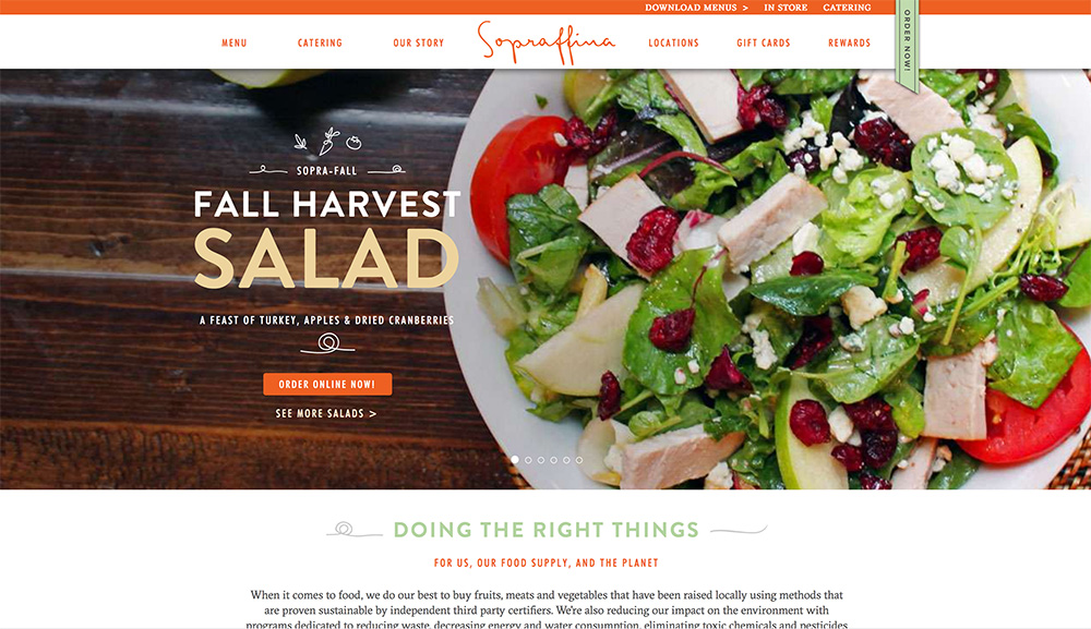
While this website looks nice at first glance, there are some usability issues that are worth noting.
Why restaurant menus must be responsive
An important feature of deli websites is the menu. The menu must be responsive, and on this website it is. Good! But there is another feature of their menu that isn’t ideal, but let me address the responsiveness issue first.
Responsive menus are easier to read, regardless of the device being used. Image-based menus on mobile are either too small or have to constantly be zoomed in and out or left and right. Responsive restaurant menus reformat automatically to fit the size of the user’s screen.
Another reason that responsive restaurant menus are important is that they are fully searchable. This means Google can index individual menu items. (An image based menu is not searchable.) Text-based menus are also easier to update. Finally, if the site visitor wants to cut and paste from your menu, they will find it more difficult and sometimes impossible if the menu is an image or even a PDF.
So if Sopraffina’s menu is responsive, what’s the problem? The issue is more subtle. Sopraffina restricts the user to view only one tiny segment of the menu at a time. Separating the breakfast menu from the dinner menu makes sense, but there’s no benefit in breaking down the menu into such tiny pieces. When there are so few items in a category such as Bakery, Breakfast, and Breakfast sides, why not list them together? This is a subtle distinction, but it is an important one.
Finally, centered text is more difficult to read than text that is set flush left, and each of Sopraffina’s menu items are centered. Learn more about Centered Text vs Flush Left text by reading a recent blog post.
METROPOLITAN MARKET
Metropolitan Market
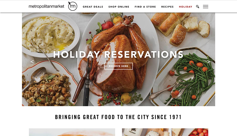
The thing I love best about this website is that it is so easy to use. Every page has a clear call to action. You don’t have to hunt around for which words to click because large buttons have been created with well-shot, high contrast images of food overlaid with simple, easy to read text.
Even the pages with lots of text are simply designed. The text is black and the font-size is large. Everything about this site is simple and clear.
In addition to providing top quality ingredients, Metropolitan Market also offers grocery delivery and catering. These services are intended to make the customer’s life easier, and Metropolitan Market has done a good job with their website to illustrate that using their services will be simple and easy.
Getting someone to try a service the first time can be a challenge. Having a website that doesn’t frustrate the user, but instead allows them to find what they need quickly and easily, can only reflect positively on their opinion of that company.
Metropolitan Market wants to be the expert in their field. This will not only enhance the public’s opinion of the company, it can also reflect well on all the products that the company sells. To strengthen their reputation as an expert, they provide information that goes beyond “here’s what we have for sale.” Metropolitan Market provides interesting recipes, with easy to follow instructions, and illustrated with a large and beautiful photo.
JASON’S DELI
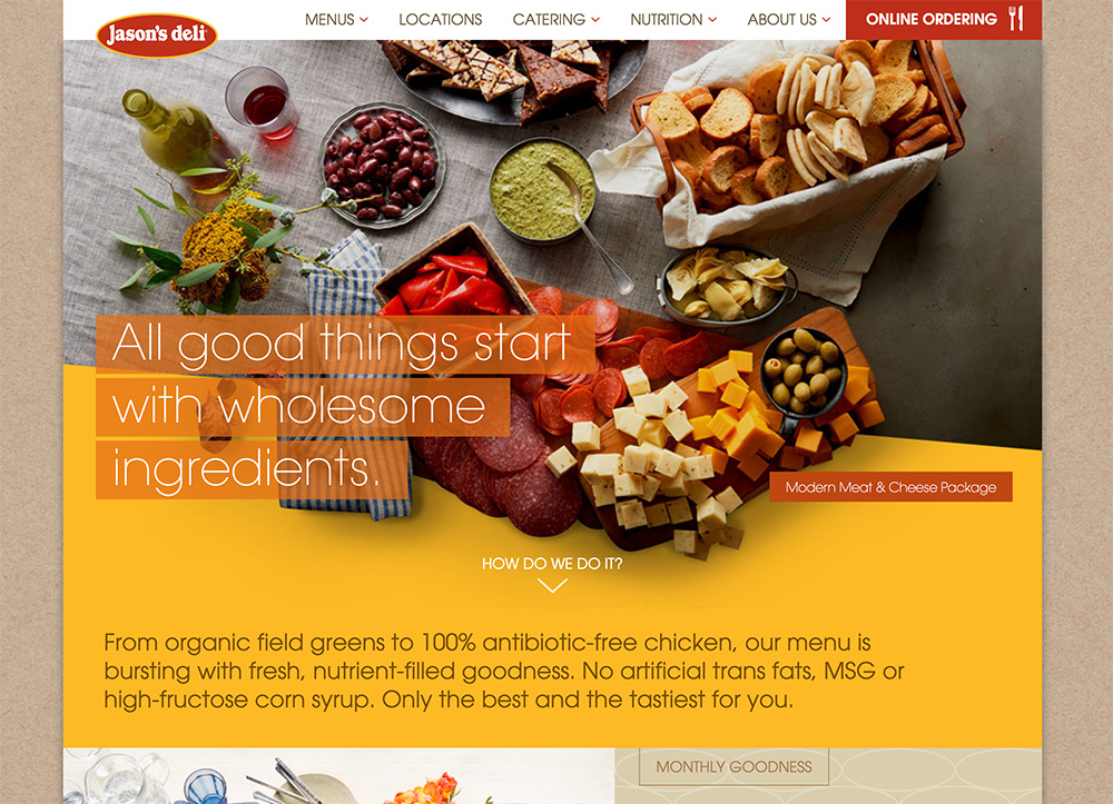
Jason’s Deli
At first I loved the look of this website, but diving deeper I found it to be confusing and somewhat overwhelming.
Several of the catering packages are set in reverse type. Reverse text is okay in limited situations. Having an entire block of reverse text is rarely a good idea. Learn why reverse text is harder to read. We want it to be easy as possible for the customer to read the text. Why make it more difficult?
Several of the pages have so much going on, that it’s difficult to determine the purpose of each page. When first landing on the homepage, or first moving to another page, it’s pretty clear where the designer wants us to look. The top of the page is well-designed, clean, and easy to follow. However, once you start scrolling down on several of the pages, there is so much going on that it’s impossible to discern any hierarchy. Overlapping backgrounds are cool, but does it help the user navigate the site? Does it make the content easier to understand?
Some pages are great. The blog page, the individual catering pages, and the About Us page, for example, are clean, streamlined, and have lots of white space. However, some of the other pages are too busy and could be easily improved by simplifying the layout.
Designing and building deli websites
Did you enjoy this article? If so, please leave a comment below. And if you’d like to learn more about how we can hep you, learn more about our web design services.