
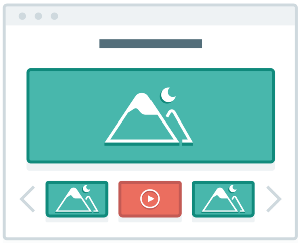
First, what is a slider?
A slider is a collection of content, primarily images, displayed one at a time, usually positioned at the top of a website’s homepage. In most cases, the slider changes automatically after a predetermined number of seconds.
Sliders (aka automatic slideshows, rotating offers) are a ubiquitous homepage design element. Until recently, a slider seemed like the perfect solution to the question, “How can I best represent all the great things that my business offers?”
Why we no longer recommend using sliders
1. Divides a site visitor’s attention
The best websites are lean machines. The user should be able to scan the page and quickly determine where to go to get the information they need. Rather than making them wait for the information they’re looking for to appear in a slider, it would be better to provide a static link.
For example, let’s pretend you have a day spa. At the top of your website is a slider that features your six best spa services. Do you imagine that the site visitor will sit there, waiting as one slide turns into another, reading each one to see if it covers their concerns? Wouldn’t it be better to create six boxes with your six key services? Then, the user can simply scan them all to find the one they want.
2. Banner blindness
Sliders have very low click through rates. One reason is that some people associate image sliders with ads and therefore just skip over them.
3. Auto-advance sliders take control away from your visitors
People surfing the web like to be in control. They don’t want music or a video to start playing automatically, and when presented with an image gallery, they want to advance at their own pace. Auto-rotating sliders take control out of the user’s hands, which they are likely to find frustrating.
4. Most sliders are not mobile friendly
A slider on a desktop computer can be large and impressive. Now look at that slider on your phone. The entire element is displayed no larger than a few inches across. Additionally, the image and text are often too small to be recognizable or useful.
5. Sliders push down the main content
6. Trust the experts
SEO expert Michiel Heijmans, a partner at Yoast, wrote the blog post “Sliders Suck and Should Be Banned From Your Website.” In a nutshell he said, “no value for SEO, it’s probably slowing down your site by loading extra JavaScript, it prevents your user from reading the good stuff immediately, and it will most probably account for less conversion as well.”
What to use instead of sliders to feature multiple ideas?
Create multiple landing pages to target your different audience segments. This will give you the opportunity to reframe your offer to reach different buyer personas.
Don’t fall into the image slider trap
When you look at the data, read the studies and track the affects, it becomes clear that image sliders are more likely to distract users rather than grab them. They also dilute your message and can slow down the speed at which your website loads. For more tips to convert site visitors to business clients, read more of our web development blog posts. Alternatively, we can review your website and offer recommendations for improvements. Call today 518.392.0846 or email [email protected].