

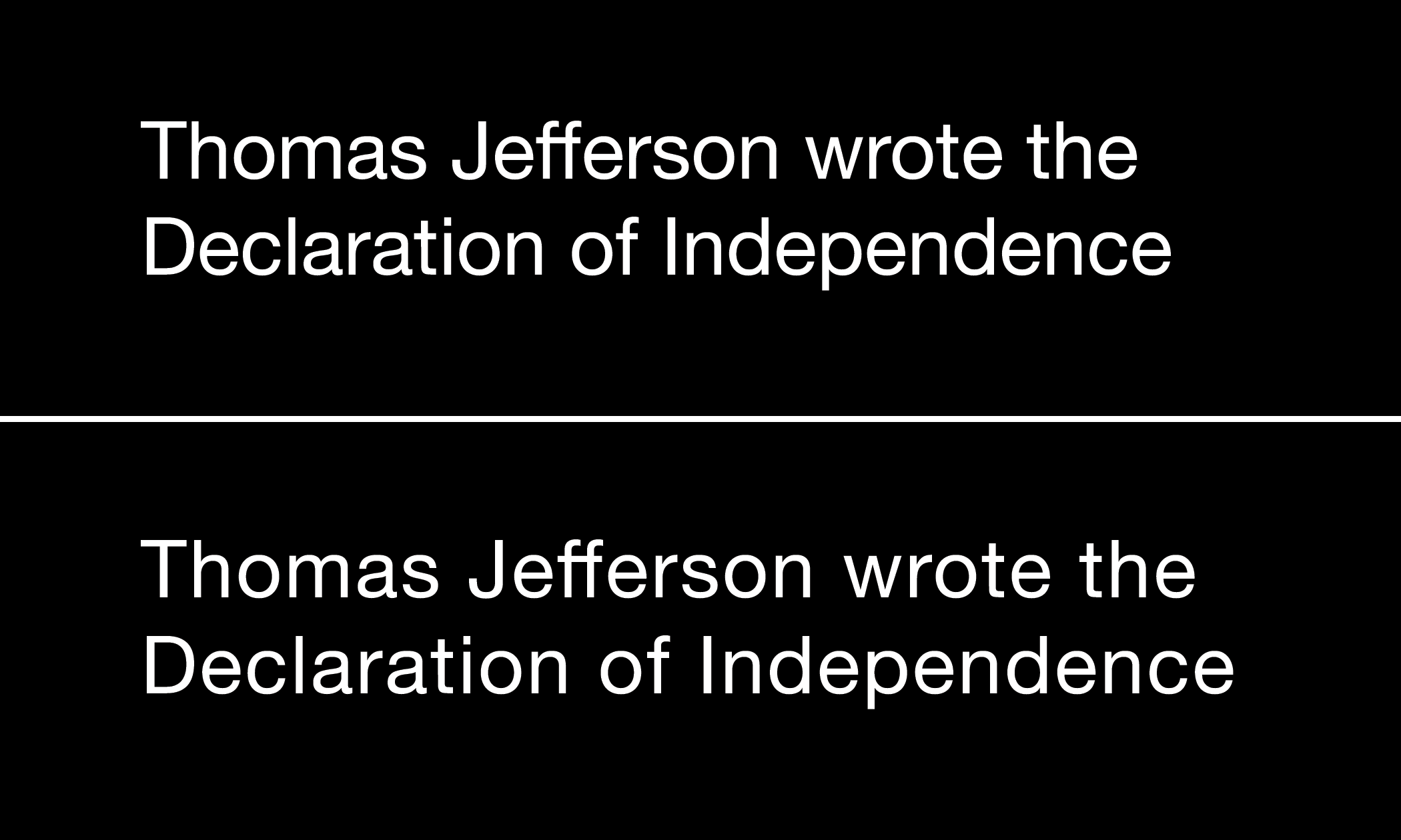
Reverse type. You see it all the time – light text on a dark background. Some designers use it to give variety to a page layout. Others are looking to make their designs “pop.” But does reverse type affect readability?
If you agree that the number one rule of graphic design is to communicate clearly and concisely, then readability has to be considered. When creating a new document ask yourself “Will the user find this easy to read?”
The best designers understand that the primary goal of any graphic design project is for the reader to read the words and comprehend its instructions. To see the page but not read the words isn’t enough. The ultimate goal is not to have the reader say, “Wow, what a cool design!” Rather, the goal should be for the reader to be compelled to do what the text conveys.
But don’t just take my word for it.
There has been significant research on inverted (reverse type) color schemes.
“Reverse typefaces can dramatically reduce readability.” – Colin Wheildon, 1990
Wheildon’s results for serif type printed in reverse compared with the same text printed black on white:
Color combination – comprehension level
| Text printed black on white | Good 70% | Fair 19% | Poor 11% |
| Text printed white on black | Good 0% | Fair 12% | Poor 88% |
| Text printed white on PMS 259 (purple) | Good 2% | Fair 16% | Poor 82% |
| Text printed white on PMS 286 (royal blue) | Good 0% | Fair 4% | Poor 96%. |
45% of the population has an astigmatism. This huge group finds it harder to read white text on black than black on white. That’s a lot of people. Ignore their needs and they may never read your ad, webpage or sign. – J Am Optom Association study, 1989
“Dark characters on a light background are superior to light characters on a dark background… participants were 26% more accurate in reading text when they read it with dark characters on a light background.” – London study, 1980s
“Visual fatigue was significantly greater when people read bright characters on a dark background vs dark characters on a light background.” Bauer and Cavonius study, 1980s
“In every color combination surveyed, the darker text on a lighter background was rated more readable than its inverse (e.g. blue text on white background ranked higher than white text on blue background).” – Austin State University study
“Ads with black on white text had a three times higher response rate than ads with white on black text,” advertising guru David Ogilvy, 1970s
Other factors that can affect the readability of reverse type
The effect of lighting on readability
If you’ve ever tried using a smart phone or computer outdoors when the sun is bright you understand that this can be difficult. With reverse text, the effect is exacerbated. White type on a black background in bright sunlight can be unreadable.
The effect of font style on readability

Ultra thin type styles, very light serifs or fonts with extreme weight contrast can be even more challenging set as reverse text. That is why we recommend avoiding these styles.
The effect of blank space on readability
Blank space, also called white, negative or empty space, is the area between and around elements on a page. This blank space improves legibility. It gives the reader a place for their eyes to rest, even when the white space is black.
In addition to the space around elements, consider the space between letters. When white letters are used on a black background, the whiteness of the letters can appear to spread out beyond the edges of the individual letter shape. This is called light bleeding. By increasing the space between the letters we can reduce the impact of this effect.
The quantity of text can also affect readability of reverse text

We never recommend reverse type for large areas of text. Light colors on darker background can lead to eye fatigue or strain and hinder comprehension.
Are you looking for additional help with your graphic design project?
There are exceptions to every rule. Using light text on a dark background can help direct one’s attention to a single element, as in a single word heading, a title or a label. But as a general rule, make the text easy to read and more people will read it. Use dark type on a light background rather than light on dark.
If you need help designing an ad, brochure, website or sign, give Suzanne a call at 518.392.0846 or email [email protected].
Excellent column! I’m going to forward this to my cable company, which has made their station guide almost impossible to read by using a back background with (small) white print. Complaints from users, which started in June 2016, go unheeded. Very frustrating!
Penny Van Amburg
Tucson AZ, USA
Hi Penny,
That does sound frustrating.
Thanks for the feedback!