
Some developers are still designing websites with the assumption that users will access the site via desktop computer. However, current statistics indicate that 55.7% of worldwide web traffic comes from mobile (2023 StatCounter). Add tablets to the mobile stats and that number rises to almost 58%. While these percentages are averages and will vary our website, it is clear that if you build a website for desktop users only, you will be missing out on converting anyone visiting your website on a smaller devise. It is likely to be your first point of contact with potential customers. In order for the experience to be a good one, your site must be mobile responsive.
What is Mobile Responsive?
A mobile responsive website is a design approach where page layout is dependent on the size and orientation of the device being used. Responsive design adapts and optimizes to the device.
According to Google’s 2023 Think Insights on mobile:
- 79% of people say they’re more likely to revisit and/or share a mobile site if it is easy to use.
Sites built for desktop computers may still “work” on a mobile device, but the user experience can be terrible.
What does mobile responsive look like?
Sites that are not responsive look like a very tiny version of what you’d see on your PC. To read text on a site like this or to click on things requires zooming in and out, then scrolling left and right, moving the site around so you can see it all.
The best solution to this problem is to rebuild your site using responsive design. Responsive web design adjusts gracefully to fit the device used to view it: desktop, tablet, smartphone or even a large screen tv.
To illustrate this concept we have illustrated below how the same site behaves on different devices when built to be responsive.
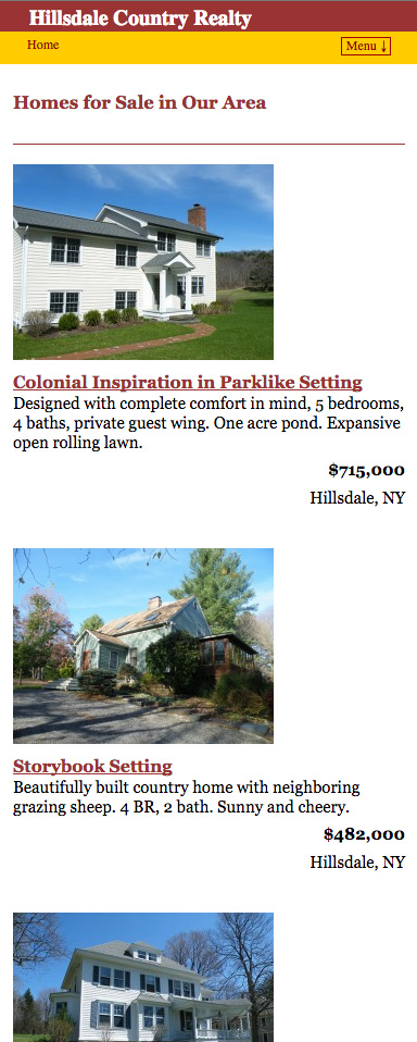
As an aexample, e built the website below for a local company, Hillsdale Country Realty. On a desktop machine Homes For Sale are in a grid format.

If this website was not mobile responsive, it would look identical regardless of the device used. For example, on a desktop machine the text would be large and quite readable (above). But on a small screen it would be much much smaller (below). To read this text on a smartphone the user would need to zoom in and out, scroll left and right.
But lucky for this site owner, the website is mobile responsive. This means that regardless of the device used, the site looks great, because the layout automatically adjusts.
Below is the same website illustrated above, but built with mobile responsive design.
Notice that each Home For Sale stacks one on top of the other. Every entry is easy to see, read, and scroll through. The text is a readable size and there is no need to zoom in or out, scroll left or right.
Are you interested in a website for your business or organization?
A website that looks works well with all devices takes knowledge and experience to build. Our strong background in computer programming, marketing, graphic and website design and content writing makes us the right team to design, build and maintain your new website.
Give us a call at (518) 392-0846 or email [email protected].