
The way an online form is designed can impact how easy or difficult it is to complete. There are many small decisions that need to be made. Each design decision can contribute to whether someone fills it out correctly, completely or if at all.
Nine online form design basics
1. Order the form logically
Filling out a form should be similar to having a conversation. The person filling out the form needs to feel comfortable answering the questions. Questions should be posed in a logical order, from general to specific. Each one should lead naturally to the next. When questions are poorly ordered, the person filling out the form may become confused. Be thoughtful about the sequence and the user will be more likely to feel uncomfortable completing the form.
In addition to ordering the questions on a form logically, consider, too, the order of your answers.
For example, if the answers are numerical, list them in order.
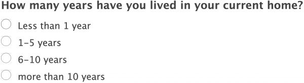
If the answers can be arranged chronologically, follow that sequence. For example:

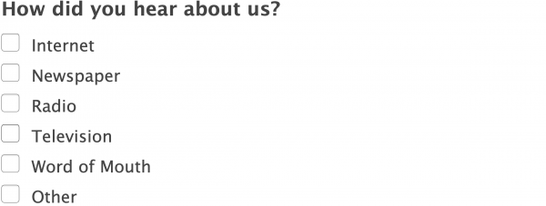
And if there is no logical sequence, consider alphabetizing the answers.
2. Limit questions to those that are truly required
Most people are busy and don’t want to take any more time than is necessary to complete a task such as filling out a form. Therefore, the more questions you pose, the less likely someone is to complete it.
Consider your own actions: before filling out a form, do you ever look to see how many questions there are? If so, you’re not alone. Many people won’t even begin to fill out a survey if there are too many questions.
How does one determine the right number of questions to ask?
There is no hard and fast number. Begin my asking yourself, “Do I really need the answer to every single question, or might it be better to make it easy for them to contact me?” Once you make contact, you can follow up with the rest of the questions.
3. Be simple and straight forward
Designing a form is not the time to be creative. The goal for any good form is to have the right people fill it out as completely as possible. Therefore, it’s important that the person filling out the form feels confident that they are doing it out correctly. No one likes to feel like they’re a dummy, so avoid using non-standard elements that can confuse a user.
4. Match fields to the size of the input
When designing an online form, the size of the field should be based on the size of the expected answer. For example, if you are asking for someone’s home state, you only need space for two characters. However, if you are asking for someone to describe their dream vacation, the field should be wide and deep. If the field is too long, users might wonder if they’re answering the question correctly. If the field is too small, it will hide part of their answer and make it difficult for them to go back proofread their own work.
5. Make input fields keyboard-friendly
Typing on a smart phone is tricky. For this reason, we recommend minimizing the amount of typing required. Enabling auto capitalization of words for fields such as name of address (but not email or password) can be useful.
6. Pay attention to tab order
Not all users navigate the page with a mouse. Some use only the keyboard. Therefore, an intuitive tab order is critical and it must follow the visual flow of the page.
7. If the form is long, provide guideposts
If your form has multiple pages, help users understand where they are by using a progress bar or another feature that counts the steps.
8. Consider label positioning when designing an online form
As we discussed earlier, forms are not good places to exercise your creativity. Instead, forms should be as simple to use and as easy to understand as possible. Where a field’s label is placed can significantly affect how easy or difficult it is to fill out.
LABELS ON MOBILE: In general, we recommend placing labels above the fields on mobile. This makes them easy to see and it allows space for label names to have a greater number of characters. Also, if there are so many characters in your label that it wraps, having the label above the field will make it easier to read. Finally, placing labels above fields on mobile means that the labels will still be visible when the fields are being filled out.
LABELS ON DESKTOP: For desktop, we generally recommend placing labels to the left of the fields. This is because monitors on desktop computers have more horizontal space and there is often plenty of room to place the label before the field, on the same line. This can be done without having to worry that the line break will be awkward. Placement of the label before the field also makes scanning easy.
Want to learn more about Label Placement on an online form? Read this extensive article about label positioning.
9. Place labels outside an input field
Labels tell users what information belongs in the form field. Sometimes designers, trying to keep the design as sleek as possible, put the field label inside the field. This is a perfect example of form over function.
If your goal is to make it easy for someone to send the most accurate information possible, then it must be easy for them to go back and check their work before submitting. However, when labels are placed inside the fields, the labels disappear when the fields are completed.
If the user can’t see the labels after the field has been filled in, it will be difficult for them to determine if they have filled the form out correctly. Also, many people will skip over a question or two when first filling out the form, figuring they’ll go back after they’ve answered the easier questions. When double checking that they have filled out all the fields, it will be less noticeable which fields were skipped if all the fields have something in them already.
Form design can impact how many people fill out the form
Whether your goal is to collect personal information or to move a customer along in the sales funnel, our nine design basics for online forms can help you achieve your goals. If you have any tips that you’d like to share with us, we’d love to hear them. Leave a comment by filling out the form below. :-)
For more information about our services, visit our website design and development page. Alternatively, you can call us at (518) 392-0846 or email [email protected].