
Many elements contribute to a company’s branding, and color is one of the most impactful. Whether you’re building from scratch or refreshing an existing brand, one of the most fundamental decisions that you need to make is what colors to use. Most of our clients come to us knowing what color they would like to be most prominent, but rarely have they considered which colors complement their main selection.
The Rule of Threes
The Rule of Threes says that things grouped in threes are more harmonious, satisfying and effective than groups of other counts. This applies to decorating, design, even writing and storytelling. This rule, or rather guideline, can be bent, of course. But the underlining theory is that items arranged in odd numbers, rather than even, create more interest.
Once you’ve selected the main color that you want to use, the next step is to find other colors that will work to complement it. This will help set a mood.
Tools for finding complementary colors
There are many tools to choose from. Below are a few of the ones we use most often.
Sessions College Color Calculator
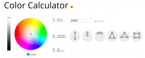
This free tool allows you to explore color options quickly and easily. Start by choosing your base color or colors. Next choose a color harmony. When color combinations create pleasing contrasts, they are said to be harmonious. Use these harmonies to create a particular mood.
The Sessions calculator, and other similar apps, allows you to choose from six harmonies:
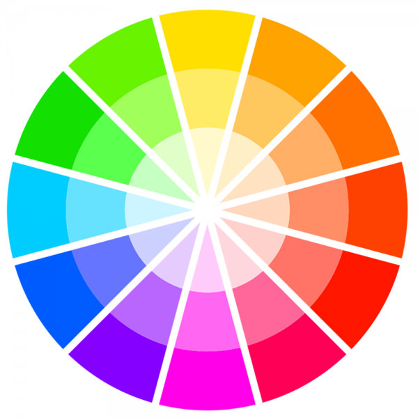
- Complementary: these are located on opposite sides of the color wheel
- Monochromatic: different tones from the same angle on the color wheel
- Analogous: groups of three colors that are next to each other on the color wheel
- Split Complementary: one base color and the two colors adjacent to the directly opposing color on the color wheel
- Triadic: colors that are evenly spaced around the color wheel.
- Tetradic: a combination of four colors that form a rectangle on the color wheel. Colors on the short side of the rectangle are spaced one color apart.
You can find the Sessions Color Calculator at https://www.sessions.edu/color-calculator/
Color-Hex.com
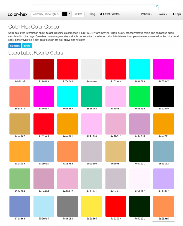
The homepage of this website displays 42 of the most popular colors. Clicking on one of the colors brings you to a page with the complementary colors of that specific color. Personally, I use this website when I know what color I want to feature. I enter that hex color in the box at the top of the page, click Get Info and get the complementary colors for the one I have selected.
Visit the Color Hex website.
Color.Adobe
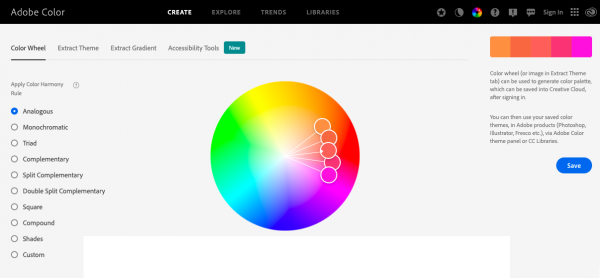
This tool lets you try out and create various color schemes, each consisting of five colors. Palettes can then be saved directly into Creative Cloud. You can find this online color generator at https://color.adobe.com/create/color-wheel.
Canva.com
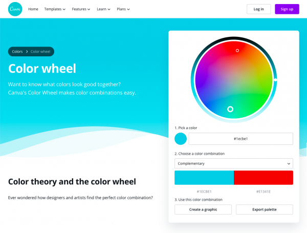
Click on a color in the wheel and Canva automatically shows you which colors complement the chosen color. For more options for that same color, select a combination from the drop down selector.
Find the Canva color wheel at https://www.canva.com/colors/color-wheel/.
Coolors.co
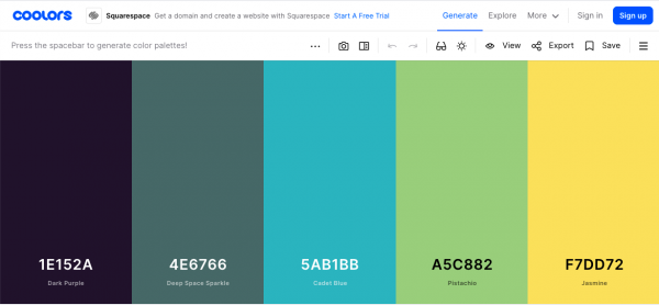
If you have no idea what colors make sense for your project, this site may be just the inspiration you need. Click on the Generator button and five vertical color bars fill the screen, with hex colors noted at the bottom. Keep pressing the spacebar until you land on a color scheme that appeals to you.
Blog posts about website color schemes
I visit these blog posts often at the beginning of a project, when I’m still thinking about what color scheme will make sense for my new client.
- 50 Gorgeous Color Schemes From Award-Winning Websites
- 39 Inspiring Website Color Schemes to Awaken Your Creativity
- 29 Beautiful Color Schemes From Award-Winning Websites
Keep accessibility in mind
Those with poor or limited eyesight find low-contrast color combinations be difficult to read. (Black text on a white background has the highest level of contrast and is easiest to read.) It is critical to make sure that your combination of text and background colors passes the contrast threshold described in the Web Content Accessibility Guidelines (WCAG).
There are several color contrast testing tools available online. The one we use is from Web AIM (Web Accessibility in Mind).
Tools for complementary color palette inspiration
The list above is far from comprehensive. However, they are the tools that we use regularly. If there are tools you prefer to use and you’d like to share the information with us, that would be much appreciated. Please comment below.
And if you’re looking for a web developer to help with your own website, give us a call at (518) 392-0846 or email [email protected]. If you would simply like to learn more about the services we offer, visit the website design and development services page of our website.