
One of the first phases of building a new website involves learning about the client and their industry. We are currently working on a new website for a local residential community for seniors. As part of the “research the industry” portion of the project, we look at hundreds of different assisted living websites from across the county. Doing this kind of investigation gives us a basic lay of the land. We get a idea of what language is commonly used and what website features are typical. We also get ideas for how to improve usability and how make our site stand out from the competition.
As we’re looking around, we keep track of the assisted living websites that we like and features that we find notable, both positive and negative. We make a list and share it with the client. This is an important exercise because we can get feedback on our ideas before implementing them. This provides us with important direction long before design begins and start getting a clear sense of the client’s wants and taste.
We found a few assisted living websites that are far from perfect, but that in general have the feel that seems appropriate for this client. Our aim is to create a design that is light and simple. Nothing should be confusing or overwhelming. Of course, we want to project vitality and joy too, but softly.
Below is a list of the Assisted Living Websites that we found notable:
Vintage Grandview
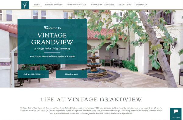
Things we like about the Vintage Grandview website:
- Simple and easy to use.
- Type is large and easy to read.
- Photos are big. We particularly like the three image links under the big photo at the top, where you can learn more about the things they think their audience is most interested in. The person who designed this website thought carefully about what three things the site visitor is most likely to be looking for.
- The montage of photos at the bottom of the page is nice.
Things we don’t like:
- “Welcome to Vintage Grandview…” is way too big and practically covers the beautiful image. We do like the “Schedule a visit” and “Call us” calls to action, but they don’t need to be on top of the picture.
- Some of the pages use parallax scrolling, a technique where background images move slower than foreground images. We find this distracting and not helpful.
Springbrooke
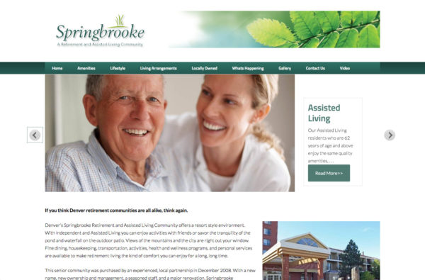
The thing we like best about the Springbrooke website:
- A video is a great thing to have on assisted living websites. People love videos and Google loves them too. It’s a shame though that the video is all the way at the bottom of the page. We’d rather see it be more prominent.
Things we don’t like:
- We are not fans of the auto advance slider.
- No call to action.
- The image gallery in the side bar is too small.
- There are too many navigation titles, they are too small and hard to read. The topics could be better consolidated.
Oakwood Village
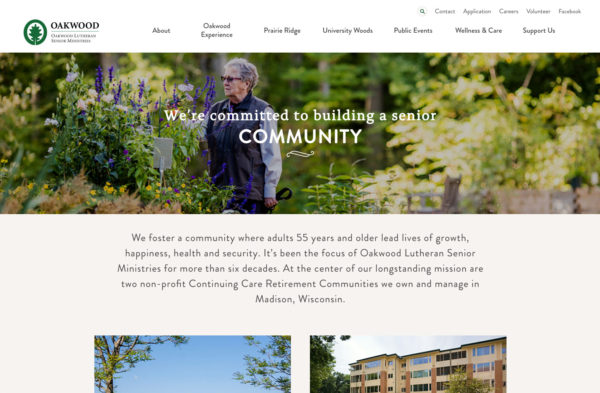
The thing we like about the Oakwood Village website:
- We really like the ease of getting around this website. Text is easy to read. Type is larger than ib most websites. There are also some nice photo galleries at the bottom of the pages under “wellness and care.”
Things we don’t like:
- We like the background image on the prairie-ridge page but some of the other background images are distracting. When using a background image, we prefer it to be the same on every page, otherwise it makes the site feel less consistent/cohesive.
- We don’t really like the combination of fonts that they chose, they aren’t complimentary.
- The navigation text is centered vertically and horizontally, which makes it more difficult to read.
Atria Senior Living
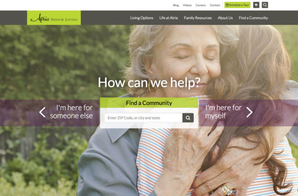
Things we like about the Atria Senior Living website:
- We love their Family Resources page. Some really good stuff there – particularly the “Having ‘the talk’” article.
- The navigation is well organized.
- The use of breadcrumbs
Things we don’t like:
- Again, the text on top of the image takes away from the impact of the image. We’d just move the information down a little.
- This site uses parallax scrolling, too.
LeisureCare
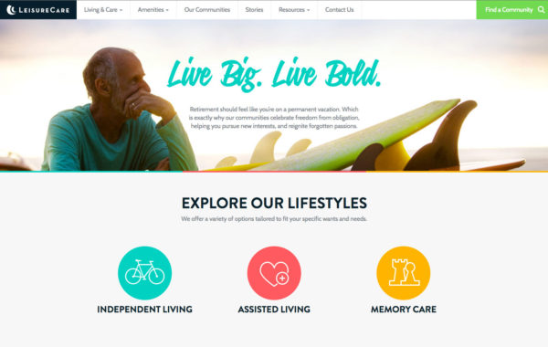
Things we like:
- This website has some great content. We love the section “Meet Fun People. Do Fun Things.” In fact we love the whole “Stories” section.
- This website has an unusually small header area. We like this because after the first page, the header area is usually wasted/redundant space.
The thing we don’t like:
- The submenus are too clever. While it’s kind of cute, we don’t think it’s easier to use. We would prefer to avoid submenus like this.
The Springs at Tanasbourne
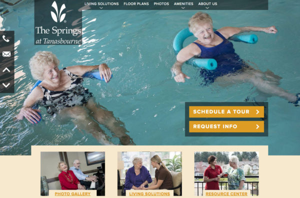
Things we like about the Springs at Tanasbourne website:
- In previous examples we explained that we don’t always like when text is set over an image, particularly when it takes away from the impact of the image. But the use of the text overlay on this website is really good. It brings the call to action right up to the front, without taking away from that fabulous photo of the ladies in the pool. “Schedule a tour” call to action is a good one and should be upfront, as it is here.
- As on the Vintage Grandview site, this site has three image links that take the user to the three pages that the Springs Living people think are the most important. There are two more image links, further down, that are also well done.
Things we don’t like:
- Strange that they don’t think Contact Us should be top level in the navigation. We would make it so. In fact, we’d probably rework all the navigation. It seems disorganized.
- When you click on a top level link to go to a new page, the nav bar moves down, changes color, and then returns to its correct position. That does not seem right.
The essential ingredient for all good assisted living websites
As with most websites, a key ingredient to building your online reputation is to establish yourself as the authority, the expert. This is particularly important for assisted living websites who are asking you to trust them to provide safe, secure surroundings for your loved one and to take care of them in a kind and loving way. Building your image as authoritative and “the expect” begins with good information. Are you answering the questions your visitors have in mind, and are you providing useful information for questions they hadn’t yet considered?
If you have an assisted living facility and would like to improve or replace your website, give us a call at (518) 392-0846 or email us. Visit our website design and development page to find out a little more about what we do.