
Are you looking to have a logo designed for your company or organization? Our Logo Design FAQs can help ensure that you and your designer agree on the fundamentals so that you communicate clearly about your new logo. We hope you choose us to design your new logo, but even if you don’t, you’re likely to find the questions and answers below helpful.
Have a discussion with your designer about the definition of “logo” and its purpose before design begins. This will reduce the possibility of a misunderstanding. When a client and their designer can agree on fundamental design principles, when they are able to use the same language, there’s a greater likelihood that both leave the project satisfied.
Q. What is a logo?
A. At the most basic level, a logo is a symbol that identifies a brand. It is a highly-recognizable graphic that is the face of a company.


Q. What is the purpose of a logo?
A. The purpose of a logo is to be the visual representation of a company. It is meant to help people learn to recognize, remember and connect with a brand.
Q. Should people be able to identify what a business is or does by its logo?
A. This is the third of our Logo Design FAQs. The purpose of a logo is not to explain what a business does. The business name, slogan or tagline, website and other marketing materials will do that. While the look and feel of a logo should be consistent with what the business is about, a logo is not an ad.
Q. Why is it important that a logo be simple?
A. Simple logos are easy to recognize. They are also more memorable than ones that are intricate or overly-complicated. Simple shapes scale better and work in a variety of layouts. This is important because your logo may be displayed as small as a 16 pixels high as a website icon or as large as 22’ wide on a billboard.
Q. Does a logo include a company slogan/tagline?
A. No. A logo and a slogan/tagline are two different things. It can be useful to have the two as a single graphic, but they are still two separate things.
Q. Why should the logo be designed in black first?
A. This is the sixth of our Logo Design FAQs. Working out a logo design in black and white allows the designer to focus on the basics of the idea. Rather than being distracted by color and intensity, designing in black and white makes it possible to concentrate on the lines, shapes, positive and negative spaces and overall idea. Finally, if the basic design depends on the use of color, your logo will be less effective when the only option available is black and white.
Q. Does my logo need to include my business status: INC, LLC, DBA?
A. No. Look at the logos of the most successful companies. They rarely include these designations.
Q. Why do you recommend avoiding stock art or any other graphic with unknown origin (that you did not create yourself) as part of a logo?
A. In most cases, using stock art as part of your logo would not be appropriate. If the stock art was purchased, it likely came with restrictions including how many times it can be printed and whether or not it can be sold as part of another design. If the stock art was not purchased, it should be obvious that using it in your logo would infringe on the original creator’s copyright.
Q. What is the best way for a client to describe color?
A. One of the trickiest parts of designing a logo is selecting the exact shade of color that the client has in mind. Without a specific example to reference, you and your designer could end up going back and forth hundreds of times before you find the right shade.
The simplest way to ensure that your designer uses the color you want is to find an example of that color in use. The most accurate option is to find the color you like somewhere in print: in a magazine, brochure, packaging, product label, anything in the physical world that is small enough to hand to your designer. Then the designer can scan the example for a near perfect match.
Q. What are the parts of a logo?
A. Excellent question! There are up to three parts to a logo. The graphic element, typeface and color palette. In the example below, the graphic element is the bullseye and the typeface spells out the company name.
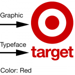
- Graphic: Some, but not all, logos have a graphic element. This element can be an icon, an illustration, a pattern or even something as simple as a line. It can be used both as part of the logo and on its own.
- Typeface: The typeface you choose for your company’s name should make sense for your business and brand message.
- Color Palette: What emotions do you want your brand to evoke? Choose colors that reinforce your brand.
Logo design FAQs
Have we answered your questions about logo design? If not, please contact us. See our complete design portfolio, along with several logos we’ve designed. Learn more about our graphic design services, call (518) 392-0846 or email [email protected].