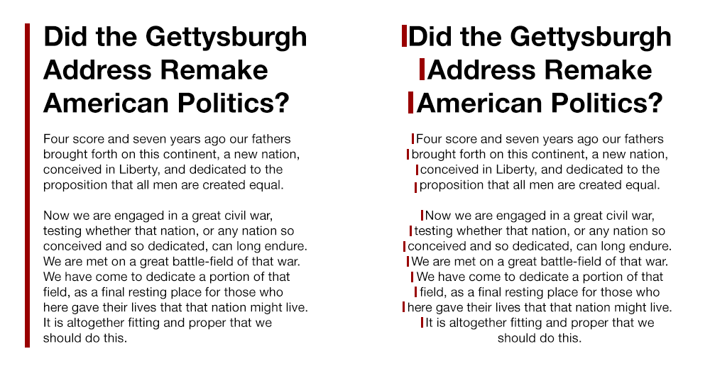
When designing a website or any printed material, it is easy to concentrate on how the text looks and forget to pay enough attention to what the text should say. The most effective materials give each element – content and design – equal effort and attention. This article addresses one aspect of design, type alignment: centered text vs flush left. To learn more about the importance of content, read our article Content Ideas to Drive Website Traffic.
The pros and cons of centered text vs flush left
Left aligned text is easier to read than centered text, particularly when the text is several lines deep. This is because when you center the text, the starting place of each line changes. Without a straight left edge, there is no consistent place where users can return their eyes to after completing each line. In order to continue, the reader has to work to find where each new line begins. Having to do this breaks up the continuity, the flow, of reading.
Left aligned text is easier to read than centered text

Books are always set flush-left. If the body of a book was centered, reading the text and comprehending the meaning would be more difficult. If readability is important to you, then paragraph text should be left aligned.
Centered text – is it always bad?
Centered text is not always bad; use it sparingly. Balance and symmetry are innately comforting. If you are tempted to center the text, ask yourself, “Is the headline or text short enough to be scannable?” If the site visitors’ eyes aren’t forced to repeatedly search for where the line begins, then centering can be used effectively.
Learn more about our graphic design services. You might also enjoy browsing our print portfolio and website portfolio. For more information, call 518.392.0846 or email [email protected].
